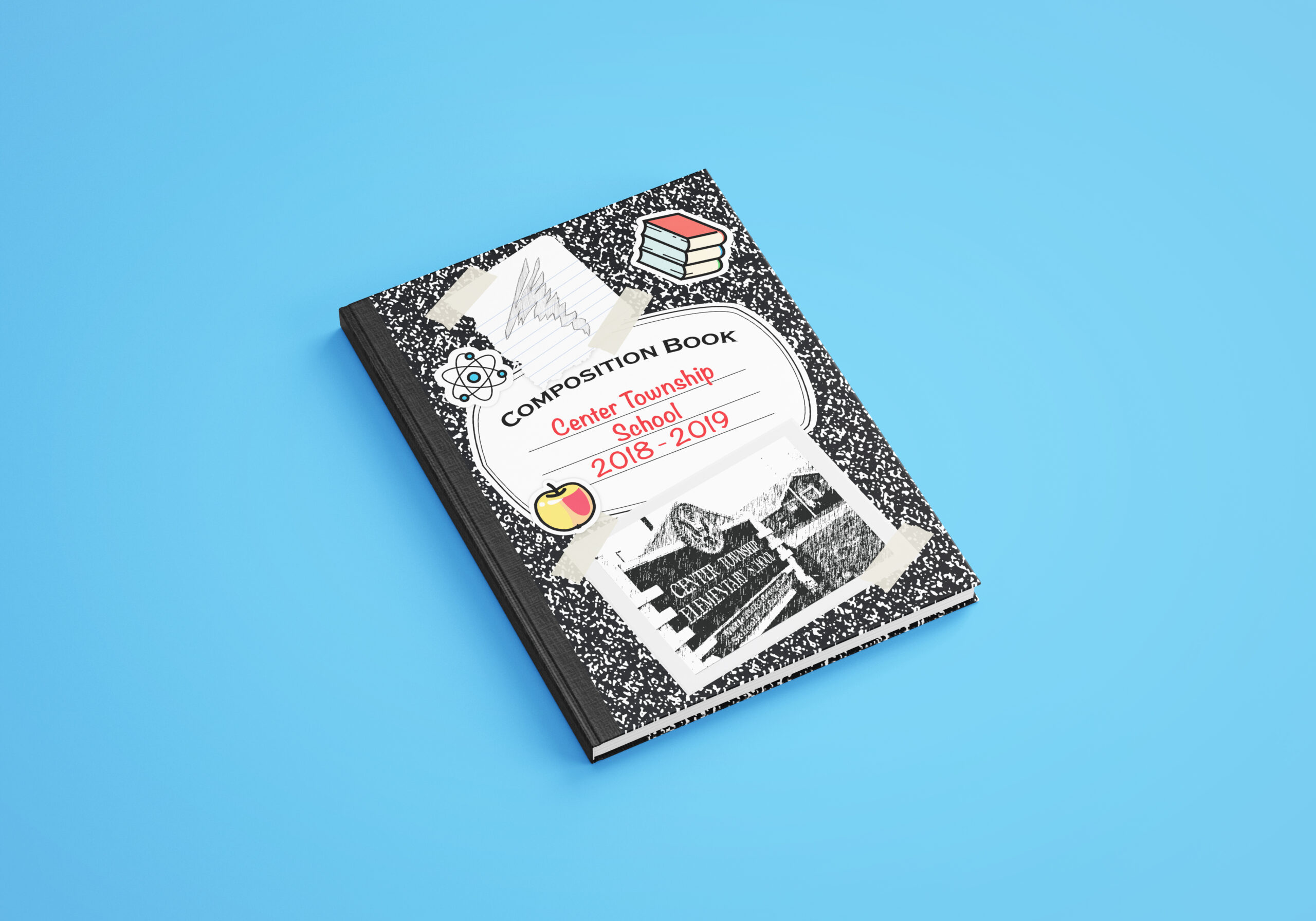
During this project I was responsible for creating a yearbook for the Center Township Elementary School, entirely by scratch. I came up with a theme, as approved by the school, and created my own drawings and graphics to match the notebook idea that I came up with. I took the photos provided by the school and edited them as needed to fulfill the needs of the product. I was then responsible for submitting the pages and designs in the correct order and format to the school’s chosen publisher. In adherence to the privacy of the children I can not share any pages containing their likeness, but my lead employer, Stephanie Slear, can be contacted as a reference to my extensive work and dedication to this project.
Completed: May, 2019
Client: Center Township Elementary

During this project I was not given a theme or idea to run with, so I had to get creative and brainstorm some of my own. In the end the only one what was appealing and workable was the notebook theme you see on the mockup above. I played off the memories of myself in school, putting stickers all over my notebooks, doodling in the margins and on scraps of paper. Through asking my lead designer, whom had a child attending the school at the time, she was able to tell me that its still a common thing for kids to decorate their school notebooks with similar things that I did. And so, with her approval, this idea became the one we stuck with.

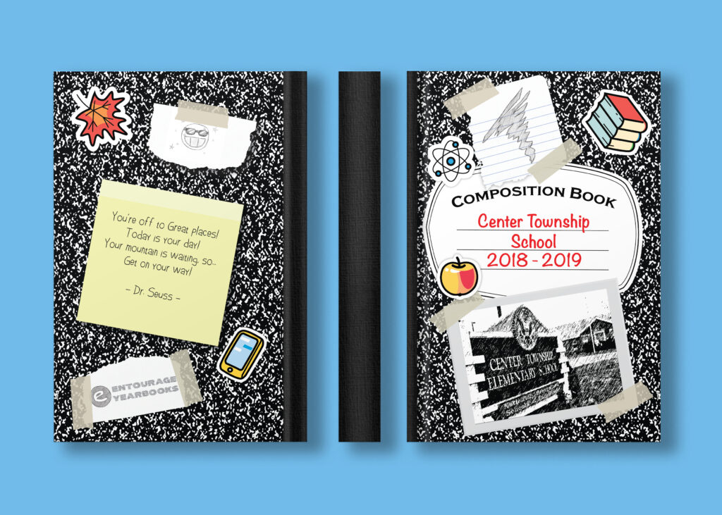
Above here is the full design of back, front, and spine. In my research looking at other yearbooks, my own included, they usually have a photo of the school and at times a fun or inspirational quote on them. I wanted to still incorporate those things with my design, so to make them seem to fit more with the hodge-podge childlike theme, I made them appear like sticky notes, taped photographs, and hand drawn doodles for the publisher’s name and the school’s sport team logo. Much of this was done with Adobe Illustrator, creating vectors and using various shadow and opacity effects to create a more believable look.

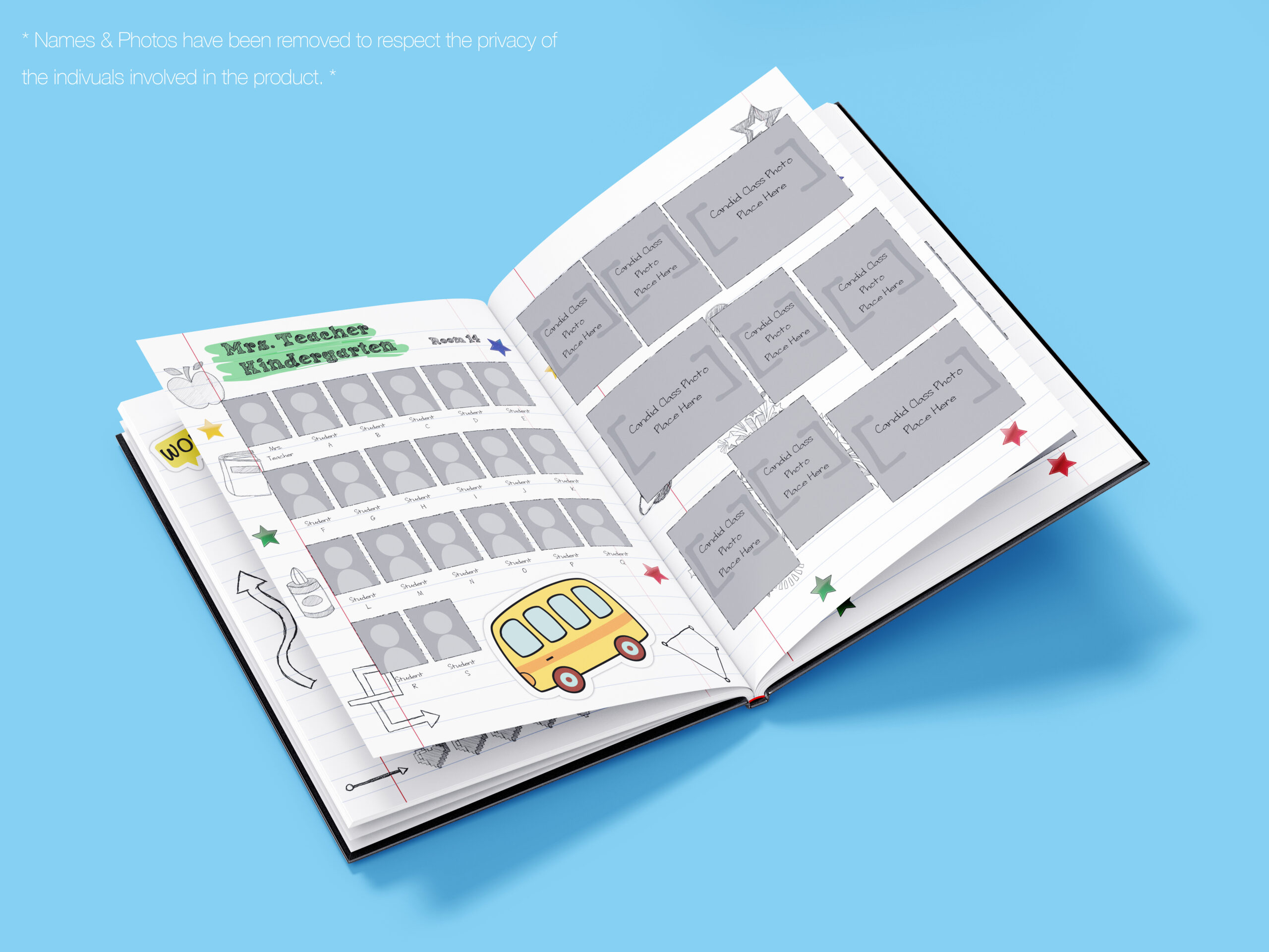
And here is an example of what the inside looks like. In this mockup it is a random page displayed, but each one is different to try and give the book a more authentic sketch like appeal. The pages would have displayed on them the photos of the class teacher and all the students to follow, with some candid shots of special moments in the class to accompany them on the opposite page. Each grade was color coded with a “highlighter” effect, starting from kindergarten and ending at the 5th grade. The pages are all decorated with unique stickers, except for the old school star stickers which I remember trying to collect as much as I could. They are also full of over a hundred individual drawings, hand drawn by myself, to get that doodle in margins feeling I was so fond of as a child. No two pages are the same, hoping to get the effect of a student’s notebook, filled with images of their friends and teachers, and full of young charm.
